
A New Identity for a Growing Non-Profit
From Pharmacy to Health Network
The
Challenge
CLIENT
Faith Community Health Network
Services: Brand Strategy •
Logo Design • Identity System •
Brand Guidelines • Sub-Brand Architecture
Role: Designer (as a part of the
AMA Agency Program)
For twenty-three years, Faith Community Pharmacy has served Northern Kentucky, providing medications to community members who don’t have insurance. By 2025 they had dispensed more than 650,000 prescriptions and helped over 10,000 people across 14 counties. The organization wanted to do more than dispensing medications. A new facility with medical, dental, and therapeutic care was joining the pharmacy under one roof, and Faith Community Pharmacy was folding into a new umbrella entity: Faith Community Health Network. Offering more services to the same patients, with an expanded scope.
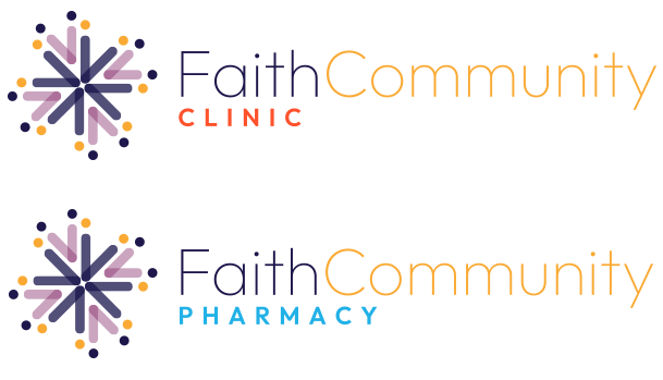
The old logo had been designed for a pharmacy. The new entity needed one designed for the full system. The new mark had to keep the trust the Faith Community name had earned over twenty-three years, and it also had to stretch across the sub-brands (Pharmacy, Clinic, Dental, and anything that might come next).
The
Solution
The mark had to escape the design shortcuts every healthcare brand reaches for. The cross would have pulled the brand toward “church,” which the team had been clear about avoiding. The heart was overused. The stick people were a trope I’d flagged in my own sketchbook notes before sketching anything.
Building an Icon Around Community
A Mark To Support A Mission
The inspiration behind this icon is rooted in the idea that Faith Community Health Network is both part of the community it serves and actively working to improve it through accessible, quality healthcare.
Community, by its very nature, isn’t made of just one or two individuals. It’s a collective, formed by people of different backgrounds, identities, and experiences, coming together to create something none of them could represent alone.
The icon started with a simple concept: two people. On their own, they don’t form a complete shape. But as they begin to connect, with each other and with those around them, they become part of something larger. Through connection, they form a network. A community. And that’s what the Faith Community Health Network logo represents: individuals linked together, creating something whole, meaningful, and enduring.
From Many, One: Putting It All Together

A Flexible System
To Grow Into
The brand guide documents the color system, the type pairing (Outfit primary, Corinthia script), the icon’s construction logic, and the full set of logo arrangements across color, grayscale, and black, in portrait and landscape. The in-house team can apply the identity themselves long after the handoff.
Primary Colors
PRIMARY COLOR USAGE
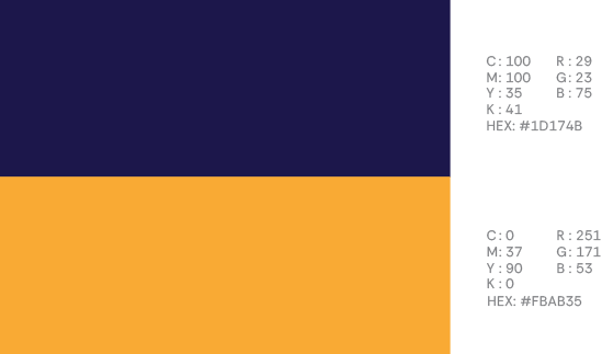
The primary colors for Faith Community Health Network are intended to used for major branding and design elements. They are the primary building blocks for this brand’s design. For the navy color this might include titles in copy, paragraph text copy; likewise for websites, the navy could be used for h1’s. The yellow is meant to compliment and be a contrast to the navy; subtitles, background colors. The titles and subtitles in this guide are a good example of how to use the primary colors.
Secondary Colors
SECONDARY COLOR USAGE
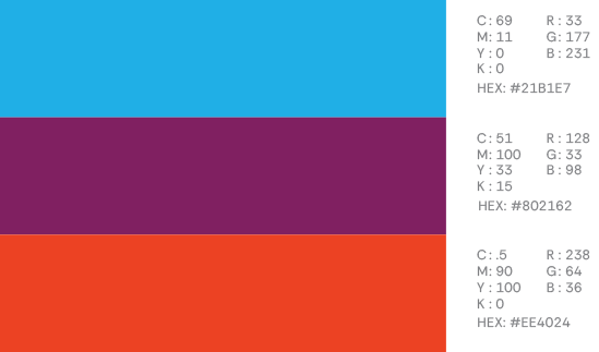
The secondary colors for Faith Community Health Network are intended to be used sparingly and for pops of color. Some practical uses might include, website alerts, call to action buttons – anywhere where you might be wanting to draw the users eyes or punctuate a design element. The page numbers in this guide are an example of how to use the secondary colors.
Neutral Colors
NEUTRAL COLOR USAGE
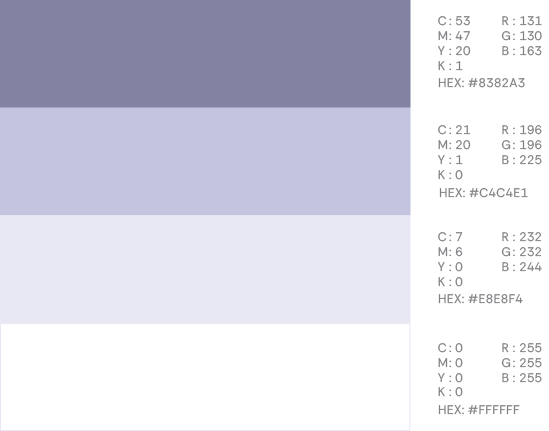
The neutral colors are meant to offer subtle shifts in design elements; accenting print pieces by being a background color of an inset box, or offering a different background other than white to accentuate a section on a website. In addition to that, colors like the dark gray and gray color can be used in a similar fashion to accent subtitles or H3’s in print or website copy.
The
Outcome