Wing haus
Elevating A Quintessential Bar Food Brand
Cultivating
A Local Experience
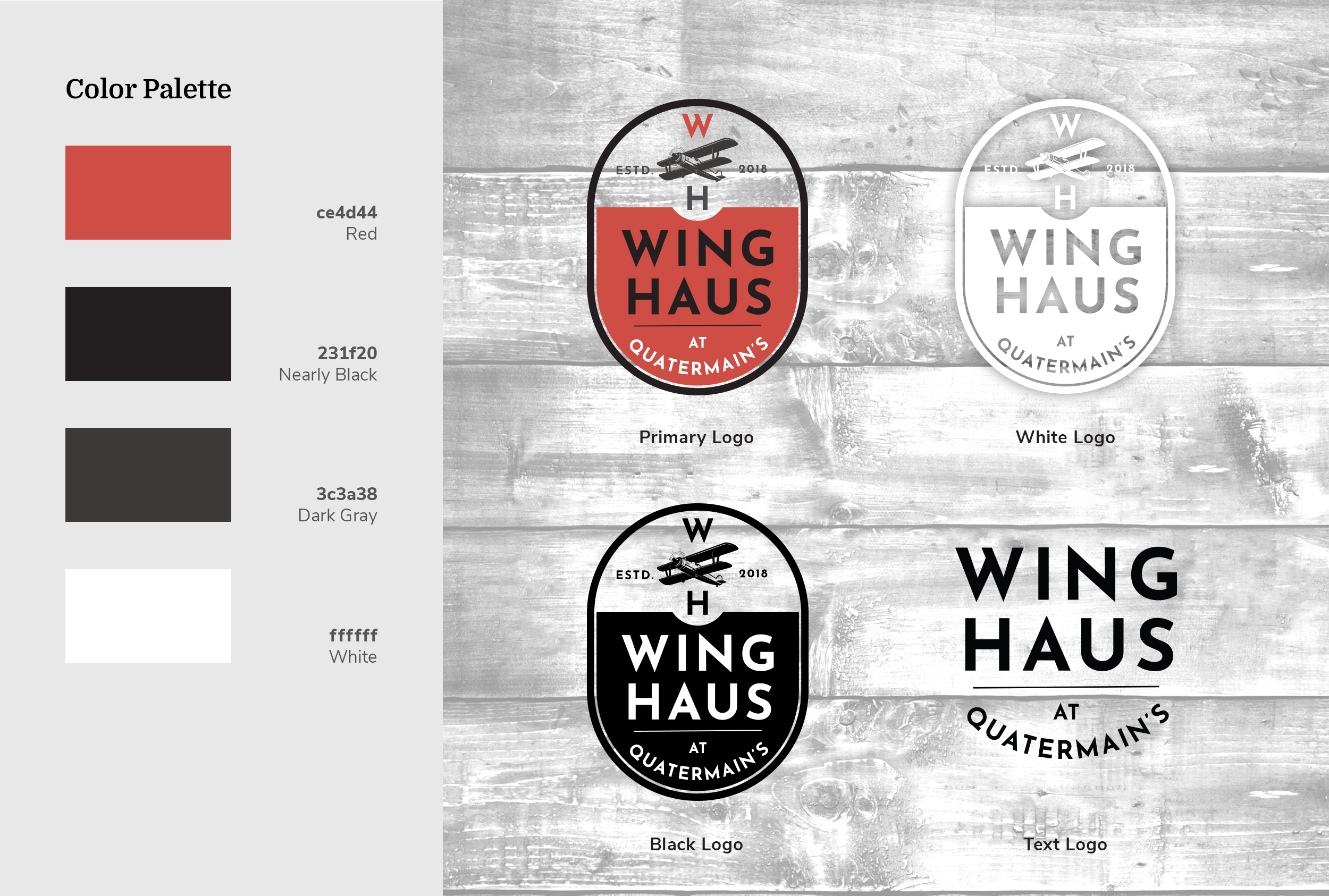
The concept for the Wing Haus was a fresh idea for Quatermain’s and I was given essentially a blank canvas to work from, which is both an exhilarating experience and can be a trepidatious responsibility. The Wing Haus was part of a local experience and was located inside an industrial setting; the design needed to reflect those roots. One of the ways this was achieved was through the economy of the logo itself. The entire mark fits into one simple oval shape and was initially envisioned as a one-color design that could be applied to packaging items as a stamp, evoking the feeling of an industrial-era manufactured product.

"I want our customers to enjoy the food and the experience, and to change people's minds about what typical bar food can be; and I want them to tell their friends."
RonOwner, The Wing Haus
A Sharable Brand
A B C D E F G H I J K L M N O P Q R S T U V W X Y Z 1 2 3 4 5 6 7 8 9 0 ! ? : ; % $ & # @
The Wing Haus logomark also had to be versatile, it needed to be used on multiple platforms, sizes, etc. and for that reason it was decided that we would not only pursue full color, black, and white logo treatments, but also develop a standalone text-only rendition.

